Wednesday, November 28, 2012

Romero Britto: Patterns of shape, line, color

Who: Romero Britto, Brazilian-American
What: paintings, sculptures, prints. Bright, flat color. Repetition of shapes, lines, colors = patterns. 
Where: Miami, Florida
When: now!
Why: He wants to make people feel happy. 
How: paints from photographs and imagination. has business sponsorship, celebrity endorsements. 


After finding this article while looking for Wayne Thiebaud inspired lessons, I discovered Romero Britto. 

I like this video of Britto being interviewed by Forbes. I found it on his website. It does mention that his first business partnership gig was with Absolut Vodka, but it's quick and my students didn't seem to notice or react. I like this video because he talks about using his own "language" in his imagery. Britto seemed like a good next artist to talk about after Cezanne and Wayne Thiebaud because he's so different. 


We looked at his work "Bimini" because it's an easy one to talk about pattern. Which flower do you think will come next? 

My students also loved looking at "Mona Cat."We tried to find matching and mismatching patterns, like  the pink and white stripes across from the pink and white polkadots. 

On the board I showed how to choose a subject, then break it up into different patterns.
I allowed students to make their own patterns using stencils, rulers, markers, pencils, and colored pencils. I wanted them to explore drawing different types. Because I was open, we had a lot of variation. Some just drew repeated shapes and colors in a line, which I was ok with, but most tried to have a subject that they broke up into sections like Britto. My goal was to have them try to fill the whole page with color. We are still working on that! 

Student pics to come! 

Friday, November 9, 2012

Drawing and Painting to Music

I did this activity with Kindergarten, Lower and Upper Elementary.

I gave them each 4 pieces of 6x9" paper, one for each song. Why did I give you four pieces? (Made them repeat this answer back to me a few times, because I had some students in the first class miss the connection and painted on all four pieces during the first song. Whoops.)


Our artist mentor was Paul Klee because he has great shapes and lines, but also because he has the best quote to define line:

"A line is a dot that went for a walk." -Klee

During the songs I reminded them about their dot's journey.
Is it running? Dancing gracefully? Bouncing? Or dragging its feet?

We also talked about choosing colors that expresses the mood of the song.

Songs I chose:

Blue Man Group, "Endless Column"

Techno, "Sandstorm"

Classical, "Swan Lake"

Blues, Roy Buchanan, "Chicago Smoke Shop"


Between each song, they brought their piece up to "circle" and laid it in the column for the song.


Saturday, November 3, 2012

Monochromatic Robots

I needed a way to name my art room tables, plan seating charts, and introduce my students to the new order in the room. (We gave it a few weeks to see if they needed to have a seating chart, and yeah, the upper elementary grades did.)

Each table was named a color of the ROYGBIV rainbow, plus a "neutral" table because I have 8 tables.

This table naming lent itself well to our next lesson: MONOCHROMATIC ROBOTS!

I am currently enrolled in Deep Space Sparkle's Teaching Art 101 ecourse to give me a little tune up on project ideas. Drawing robots was one of Patty's ideas, and I tweaked it to fit my needs.

MATERIALS:
Shapies - fat and thin
Crayons - I had mine already sorted into separate baskets of ROYGBIV colors.
White paper - I think my paper was about 12x20"

VOCAB WORDS:
LINE
SHAPE
MONOCHROMATIC
TINT
SHADE
CROSS HATCHING (for upper el)

QUESTIONS
Does your robot have a job?
Does it have a name?
Did you repeat shapes?

When these were finished I hung them up in the hallway in ROYGBIV order and they looked fabulous. And THEN the kids really started having ah-ha moments about what monochromatic really meant.


2nd Grade Robot

My example

2nd grade
Orange Monochromatic Robots -- with many shades and tints of orange in the basket


2nd Grade-- Kids clothing often times matches their work!

ROYGBIV hallway! I kept repeating the pattern on both sides of the walls. 


A little video interviewing a 3rd grade student about her Robot Book. (Not sure why the image is flipped...) 


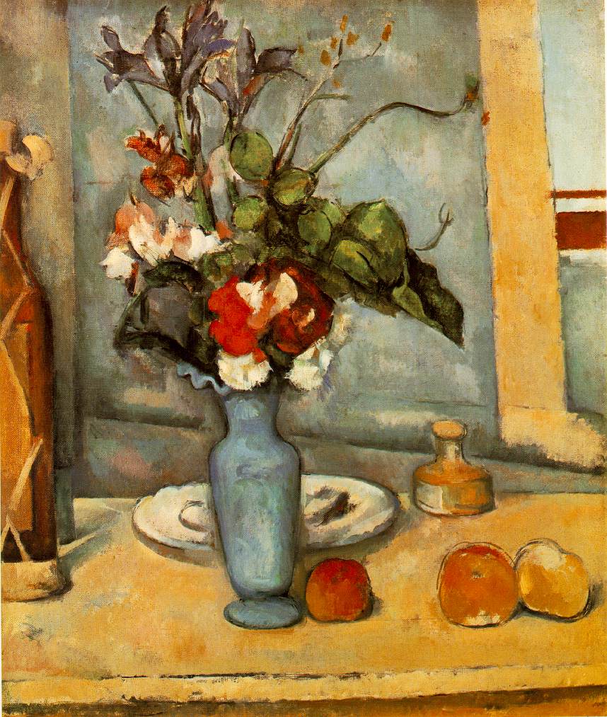
Cezanne's Still Lifes

Last week, we talked about SHAPES when we designed our Monochromatic Robots. Since that was working from imagination, I wanted to teach working from observation, especially because I have some pumpkins and gourds!

I chose to look at Cezanne's still life paintings, because he believed in simple shapes (circle, triangle, square, rectangle). The word I added this week was OVERLAP. I wrote the following words on big tag cards, which I will add to our Word Wall.

Still Life
Cezanne
Shapes
Overlap 

Cezanne loved SHAPES. And sometimes, he OVERLAPPED his shapes. Where did he overlap his shapes? 

I cut a variety of smallish pieces of colored construction paper and told the students to create at least 3 compositions, and to try different sized paper. Small is less threatening, and kind of cute. (Some only made one if they were focused and worked large, but I said three for those kids that do a quick job just so they can free draw after the assignment.)

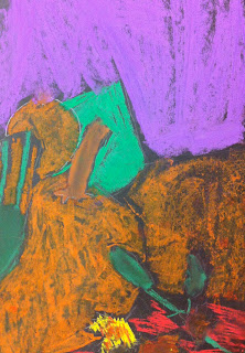
I put out chalk and oil pastel, knowing that my containers would get eventually get mixed (Virgo shudder), but I wanted them to try both materials and work them together. For the kids that truly hate the feeling of chalk, I let them use colored pencils, and they came out with some cool results, too. Either way our goal was TO COVER THE WHOLE PAPER WITH COLOR.

Oh, by the way, I did this with all of my students this week: Kindergarten through grade 8. For Upper Elementary and Middle School I also used the word CROP and we talked about zooming in to the still life and thinking about our edges of the paper.

I always find myself talking about the Venn of drawing from imagination or observation, and how artists can fall in that center hybrid of drawing from observation but making choices about how they are editing. In the images below you'll definitely see where some students let their imagination take over and just used the still life as inspiration... to some students who really took on the task of drawing as realistically as possible, to some who just broke down shapes and color in their composition. Man, I love art.

Here are some images from class:

Put your drawings on a carpet square as you finish them:
               

3rd grade:

4th grade:

7th grade:


7th grade: (with this one with talked about crisp edges vs atmosphere, and how he liked the Impressionists. He was really proud of it and shared his process with the class, which, no joke, the whole class sincerely applauded him when he talked about persevering on it.)


1st grade:

4th grade:

3rd grade:


Thursday, March 1, 2012

Winter Wonderland Puffy Paint

It snowed today!


In Lower Elementary, we looked at a few images of snowy landscapes-- both painted and photographed. We used compositional words: foreground, middle ground, and back ground.


For materials, we used a colored construction paper, then drew with colored pencils and white oil pastel.

After drawings were composed, I brought out yogurt containers that held home-made puffy paint! It's super easy to make--- it's equal parts shaving cream and Elmer's glue. Mix it and let it sit for about 5 minutes. (I made about a 8x12" pan full for approximately 50 total students.) Small paint brushes do work for application, but I think cotton swabs might be an easier clean-up solution.


The puffy-paint leaves a fun texture that is touchable!
For other projects with more possibilities, you can add paint or food coloring for a variety of colors.

Thursday, February 16, 2012

Chagall, "I and the Village"

This week, in Kinderhaus and lower and upper elementary, we looked at the compositional elements of Chagall's "I and the Village."


One way we explored this was to project the image onto the whiteboard. Students were eager to take turns drawing the details and elements of design they were seeing.

We also used a laminated copy of the image that we could write on with dry-erase markers. This worked especially well for Kinderhaus.

Here is what the board looked like at one point when we turned on the lights.

Here are some fabulous student examples for unique responses to "I and the Village."
Kinderhaus students found it helpful to draw an X on the paper to show the different sections. They broke their sections into: self, animal, neighborhood, and nature.
*One thing I learned is to suggest a color other than black for their X. White works well, as do other bright colors. Some students forget that lines don't have to be black, and black oil pastel smudges easily.*


These 2nd year students wanted to show the compositional lines connecting their dream-like ideas.


This is a bulletin board I have started to design. I included a bio of Chagall, a map of where he has been, a "job application." The strings you see hanging are elements of the painting I cut out of a second copy that students can pick up to locate it in the painting. Because Chagall sometimes painted people and objects upside-down, students will discover some fun surprises about the painting. This is a way to physically engage with the elements of the painting.